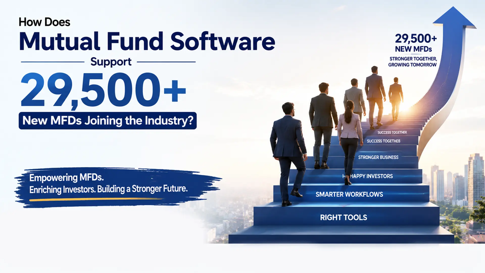
Let’s be honest. Most MFDs know how much AUM they manage, but when it comes to brokerage clarity, things are often not that straightforward.
Questions like these come up frequently:
● How much brokerage did I actually earn this month?
● How much went out as payouts to sub-brokers?
● Which clients, schemes, or AMCs are really contributing to my income?
● Is my AUM growth actually translating into revenue?
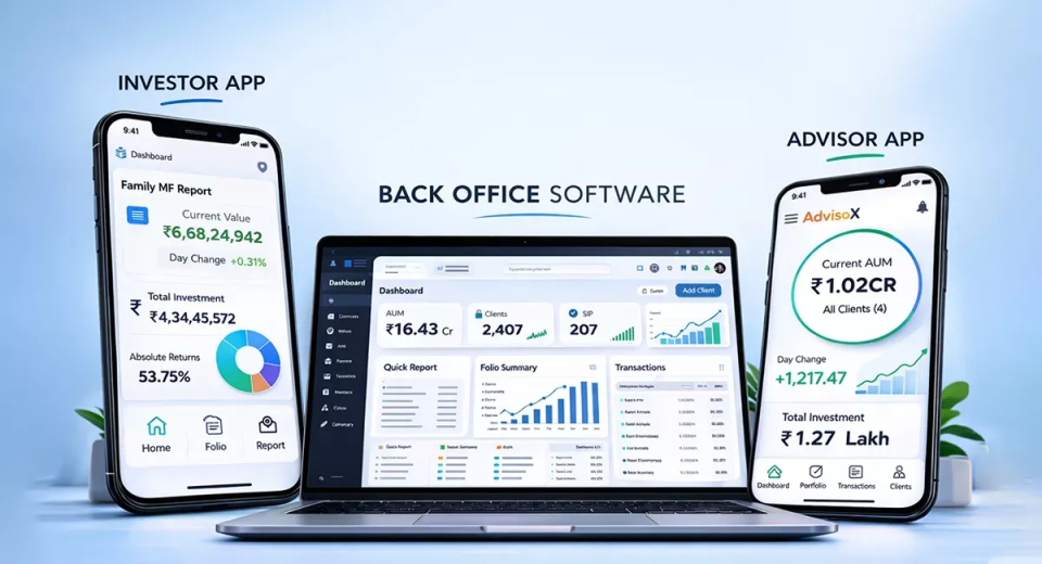
Earlier, getting these answers meant juggling multiple reports, Excel sheets, and manual calculations. Now, with modern mutual fund software for distributors, brokerage analysis has become far simpler and more visual.
How Is Brokerage Analysis Simpler Now?
Brokerage analysis is no longer spread across different reports. Today, everything comes together inside a Brokerage Analytics Dashboard, giving you a clear picture of your income at one glance.
This dashboard, within the best mutual fund software, helps you understand:
● How much brokerage do you earn
● How much payout do you give
● What your actual net income is
● Where your brokerage is coming from
Instead of numbers scattered everywhere, you get charts, summaries, and trends that are easy to understand even without accounting expertise.
What Does This Dashboard Help You Do?
This dashboard in the software can help you track your brokerage with ease. Here is all that you can do with it:
Select Brokerage for Any Period You Want
Brokerage doesn’t always need to be checked month by month. Sometimes you want to review:
● A specific month
● A full quarter
● Or a custom date range
With back office software, you can easily switch between periods and even move forward or backwards to compare performance. This makes it easier to track growth, seasonality, or sudden changes in income.
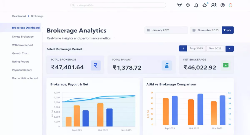
Instant Clarity With Financial Summary Cards
At the top of the dashboard, you get three clear numbers:
● Total Brokerage – the gross income generated
● Total Payout – what you paid to sub-brokers
● Net Brokerage – what you actually earned
This removes confusion instantly. You no longer need to subtract payouts manually or guess your real earnings.
Understand Brokerage, Payout, and Net Trends
One of the most useful insights comes from seeing how your brokerage moves over time. This helps you quickly understand:
● Whether your profitability is improving
● If payouts are increasing faster than income
● How stable your earnings are over different periods
See How AUM Converts Into Brokerage
Many MFDs grow AUM consistently, but income doesn’t always grow at the same pace. The AUM vs Brokerage comparison helps you understand this gap clearly.
You can see:
● Whether rising AUM is translating into higher brokerage
● Which periods delivered better revenue efficiency
This insight helps in better planning, product focus, and client segmentation.
Identify Your Top Brokerage Clients
Not all clients contribute equally to brokerage. The dashboard clearly shows which clients generate the highest brokerage. This helps you:
● Focus more on high-value clients
● Strengthen important relationships
● Plan servicing and engagement more strategically
Asset-Wise Brokerage Performance
Not all asset classes contribute equally to your brokerage income. Some may look good in AUM terms but generate lower revenue, while others quietly add consistent brokerage month after month.
With asset-wise brokerage visibility, you can clearly see how much brokerage is coming from:
● Equity
● Debt
● Hybrid
● Other asset categories
Instead of guessing, you instantly know which asset class is driving your income. This helps you answer important questions like:
● Is equity really contributing more than debt for my business?
● Are hybrid funds adding stable brokerage?
● Which asset class should I focus more on going forward?
This clarity helps you align your sales efforts, investor conversations, and product focus with what actually grows your income — not just AUM.
Track Sub-Broker Performance Without Manual Effort
If you work with sub-brokers, you already know how messy tracking can get.
Multiple people, different payout rates, different contribution levels — and suddenly, you’re buried in Excel sheets.
The brokerage dashboard simplifies this completely. You can easily see:
● Who your top-performing sub-brokers are
● How much brokerage each sub-broker contributes
● What payout amount are you giving
● What payout rate is applied
Instead of manually calculating who deserves what, you get everything clearly laid out in one place.
This helps you:
● Identify high-performing sub-brokers
● Reward performance fairly
● Spot low productivity early
● Maintain transparency in payouts
● Avoid payout disputes and confusion
Most importantly, it saves time and keeps your sub-broker ecosystem organised as your business grows.
Sub-Asset and Scheme-Wise Insights
Beyond broad asset classes, the dashboard also shows:
● Brokerage contribution from specific fund categories like large-cap, multi-cap, or thematic funds
● Top schemes generating the most brokerage
You can see the scheme name, category, investment amount, brokerage earned, and contribution percentage. This helps you understand what is actually driving your revenue at a scheme level.
AMC-Wise Brokerage Visibility
The dashboard also highlights top AMCs contributing to your brokerage. This visibility supports:
● Better AMC planning
● Strategic product discussions
● Clear understanding of revenue concentration
Conclusion
Brokerage is your business income. Having clarity on it is not optional anymore. With software, you get one place to track all brokerage data, no manual calculations, no multiple reports, clear income, payout, and profitability visibility, and better decision-making backed by data.
The Brokerage Analytics Dashboard turns complex brokerage numbers into simple, visual insights, helping you manage and grow your distribution business with confidence.